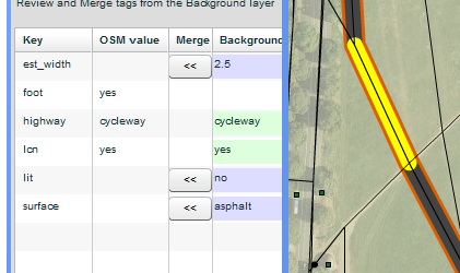
As part of ongoing efforts for the England Cycling Data project, we’ve been keen to get visualisations done, to show the extent of the data and to show where merging needs to be done.
Shaun from ITOworld – who are experts in the collection, management, analysis and presentation of complex transport data – has been working on such visualisations.
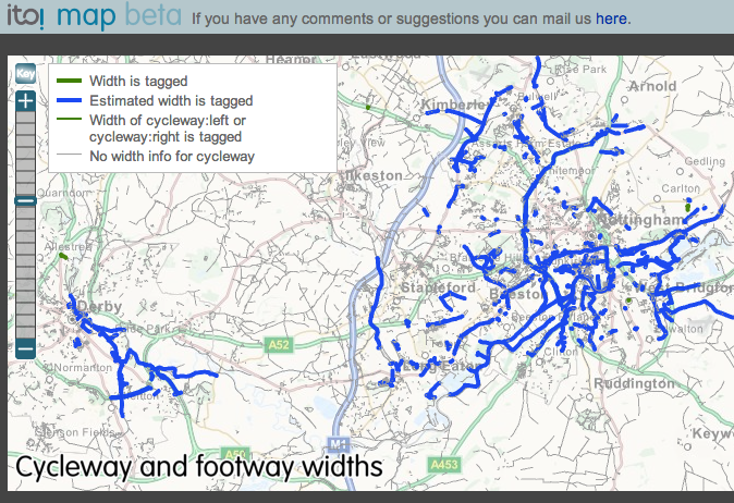
In terms of showing already-merged data, ITO Map now contains various visualisations that show the DfT data appearing in OSM in places where merging has been done.
For example this visualisation of cycleway widths, showing Nottingham, where 84% of ways have been assessed by local mappers (great work!) :
However, to assist mappers, we are keen for visualisations which show where merging work remains to be done.
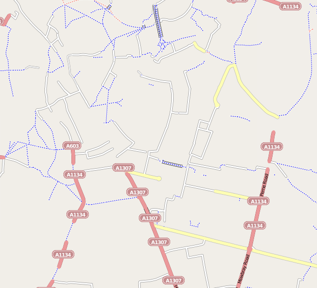
Using the raw data from the Snapshot Server (which serves the data, that is in OSM-aligned and has an OSM tag structure), Shaun has combined the data from each region into a single file, and rendered this with Mapnik. The result is a basic map showing the location of streets, roads and paths having data:
OSM-aligned DfT cycling data locations for Cambridge:
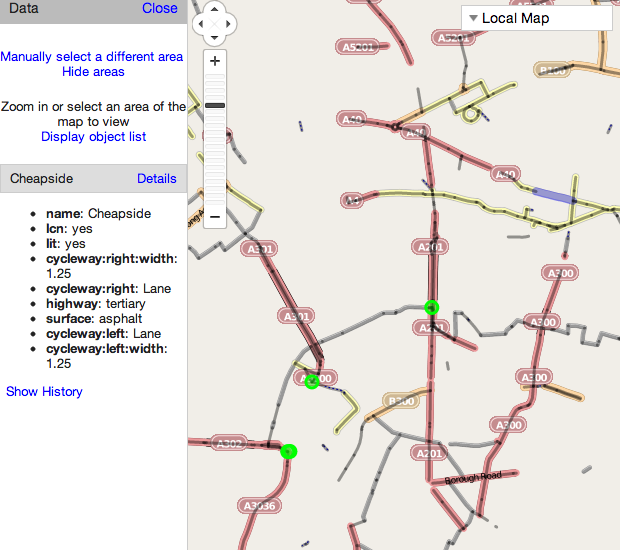
As you can see in the next screenshot, there is considerable richness in the underlying data. For instance, the section highlighted in blue shows whether the location (here: Cheapside, Central London) is lit, as well as the widths of cycle lanes, and a surface indication:
Some of the data dates back upto three years, and so the locations of streets that form the Local Cycle Networks are sometimes more comprehensive and joined up in OSM as new cycle network signage or paths have appeared.
However, in most cases, the data that is present in the DfT dataset is richer (with widths, surface, lighting information). Also, the DfT data certainly has paths that have not made it into OSM yet in some parts of the country.
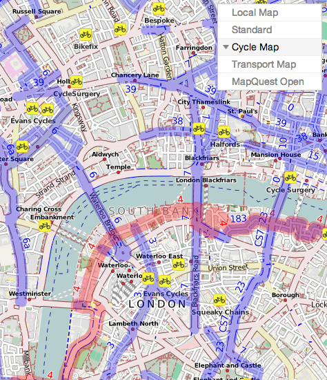
1 (left) – OSM OpenCycleMap – cycle network shown in blue, and paths as red/blue dashes.
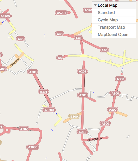
2 (right) – DfT data – showing the locations of where attributes exist.
The next steps will be to import the data into ITO Map, with similar visualisations to those visualisations created for comparing OS Vectormap District (Open Data) with OSM data.
Stay tuned for another update soon!
Shaun and Simon looking at the visualisation:

2 thoughts to “Visualisations for the England Cycling Data project”
Great work highlighting this important source of data. The ITO visualisations looks really useful (as always).
Be warned though that the DfT data may be rich but, round my area at least, it is very inaccurate.
My local path is tagged by them as NCN 10 with a dirt surface. In fact it has a nice smooth tarmac surface and it’s NCN 72 (NCN 10 is several miles to the north).
The Cheapside example you have there is interesting too: why tag cycleway:left and cycleway:right separately with exactly the same values? And I don’t think “Lane” should be capitalised either.
Just highlights the value in merging these data sources manually I suppose.
Having some form of visualisation will be really handy – got to around 80% of Nottingham and have stalled as I’m struggling to find the rest!
Many of the local routes shown on the data have been unsigned here (although most were obvious links between signed bits), however the city council seems to have got a stack load of new signs and many of these routes are being signed on the ground, especially where they connect into the, now complete, Big Track. Local knowledge is key though, the surface types especially seam to vary wildly from reality (crumbling tarmac, rutted compressed gravel, and mud are noticeable by there absence!) but the widths and lanes seam to be generally accurate if you discard short pinch points – anyone else who looks at Rushcliffe – beware many of the cycle bits have gone in the last few years :(