Over the last month or so we've rolled out a range of usability-orientated design improvements to the Journey Planner and the Photomap. We'd like to do much more, but funding has not yet permitted this (see our funding drive).
These improvements complete the areas covered by our Sustainable City Grant, which funded a range of improvements that we have reported on via this blog over the last year. We'd like to thank them again for their support, which many users have benefited from.
If you can volunteer your time to help with further design work, do let us know!
Journey planner
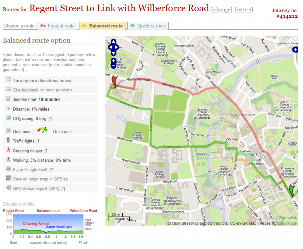
The route result page should be much clearer now:
The first thing we changed was to make it much clearer, in various ways, that there were a set of route choices available, one of the primary features of our route planner distinguishing it from more traditional car routing websites. This is an innovation we pioneered back in 2006, and is a concept now being used by other sites.
Secondly, we've made the map as large as we can fit for the current site width. We've had a lot of feedback about the size of the map panel, and would like to increase this still further with more radical changes to the design. We plan to move to a more fluid width design when funding or volunteer time permits (do let us know if you can help with design work).
A further key change has been to clean up the mish-mash of metadata about the route into a more easily-scannable and attractive set of information about the routing.
The CO2 saving compared to an equivalent car route is also now shown, again thanks to the Sustainable City grant.
Photomap
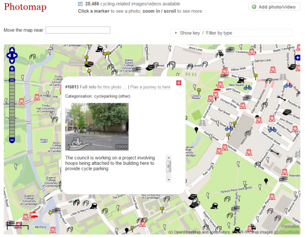
The Photomap browsing page now uses a much wider size, with mini bubbles enabling quicker previewing of photos:
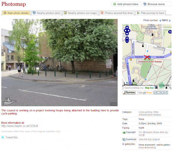
The image location page has been redesigned to show off the image much better (at size 640px), and move the less important details of the image to be less distracting.
We hope to add photo commenting soon.
Implementation
Many of these changes took a while to implement as there were a lot of knock-on code changes (the area of the code concerned had become rather 'evolved', so to speak!).
We hope you like the changes and will find they make the system easier to use. We will add more changes as time and funding allow.


One thought to “Design/usability improvements”
Pingback: CycleStreets » Blog