A guest post from Robin Lovelace:
After 2 years in the making, the paper describing the Propensity to Cycle Tool (PCT), and the thinking behind it, has finally been published (Lovelace et al. 2016). The PCT is an online tool for helping to decide where to prioritise cycling policies such as new cycle paths.
The PCT would not have been possible without CycleStreets.net, so as well as describing the PCT and its use of their routing services, this article serves as a big Thank You from PCT to CycleStreets.net.
What is the Propensity to Cycle Tool?
![]()
For those new to the PCT, it’s an online tool for helping to decide where to prioritise cycling policies such as new cycle paths. It lives at www.pct.bike – check it out!
The context of its development is explained in the accompanying video on that page. This article reports how the tool itself works and how it uses data from CycleStreets.net.
The PCT is best understood by using it to explore current cycling levels, at regional, area, desire line, route and route network levels. We will take a look at how the PCT works at each of these levels, after a brief look at the scenario results at the regional level (the senarios are described in more detail in the paper).
Under the 2011 Census scenario, the PCT represents levels of cycling to work based on the Census. This is a reasonable proxy for levels of utility cycling overall. We used origin-destination (OD) data from the Census as the basis of the PCT as this is best publicly available dataset on English travel patterns. The input data is described in the paper and can be freely downloaded from the official UK Data Service website.
The regional picture and scenarios
The first thing the user sees on the front page is a map of England, broken into 44 regions:
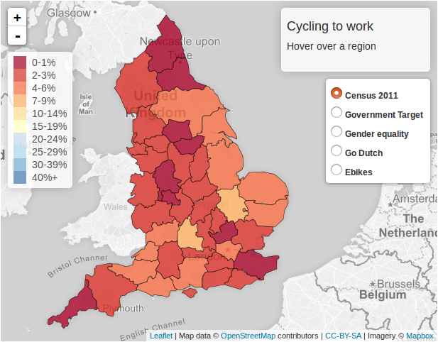
We used deliberately large regions because successful cycling plans should be strategic and joined up, covering both large areas and large spans of time. This discourages the stop-start investment plans that have typified funding for active travel.
By hovering over different regions, the user can see what the current level of cycling to work is. We can discover that West Yorkshire has a low current level of cycling to work, 1.3% in the 2011 census, and that Cambridgeshire has a relatively high (but low by Dutch standards) level of cycling of 9.7%.
An exciting feature of the PCT is its ability to allow the user to imagine ‘cycling futures’. This can be seen on the front page map by clicking on the different scenarios (set to Census 2011 by default). We can see, for example, that under the Government Target to double cycling levels by 2025, West Yorkshire’s level would rise to 3.3% (more than a doubling) whereas Cambridgeshire would see cycling levels grow to 13.7% (a larger rise in absolute terms):


Under the Go Dutch scenarios, these regions would see 23.1 and 13.5% of people cycling to work, respectively. This represents a huge leveling-out of cycling levels across the country, but still highlights the fact that some regions have higher cycling potentials than others, due to average trip distances and levels of hilliness.
Cycling levels at the area level
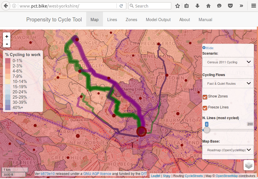
To launch the PCT for a region, click on it. Try clicking on West Yorkshire. You should be presented with the following image, which shows the area-based level of cycling to work from the 2011 Census. (When using the PCT, it is worth remembering that the visualisations work for every scenario.)
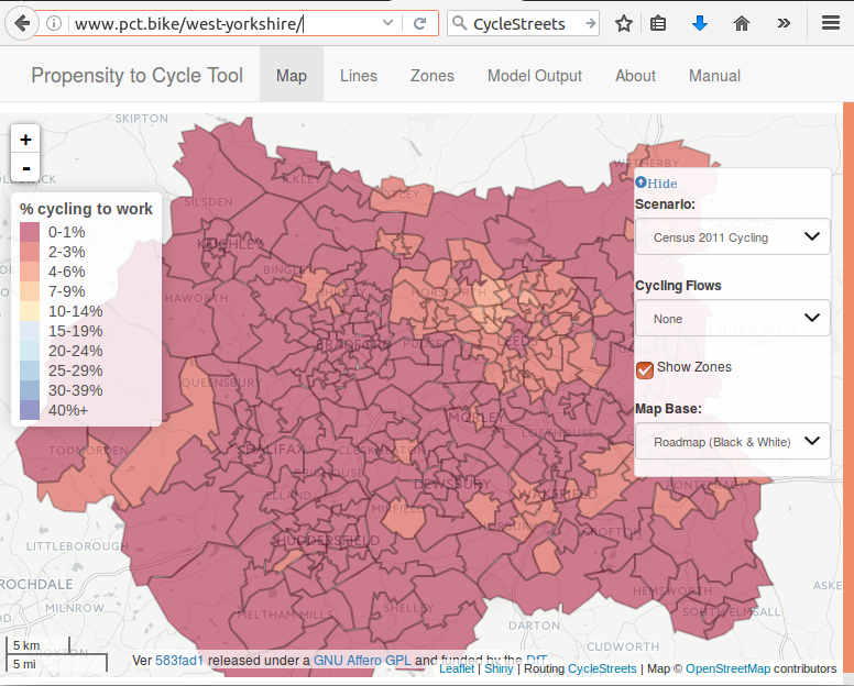
This shows that West Yorkshire has very low levels of cycling to work, hovering around 1% to 2% in most places. This suggests strongly that the region has low levels of utility cycling overall (despite the successes of the region’s sport cyclists). There is a cluster of zones with a higher level of cycling to the north of Leeds city centre (around Headingly) but even there the percentage of people cycling as their main mode of travel to work does not exceed 5%.
Cycling potential at the desire line level
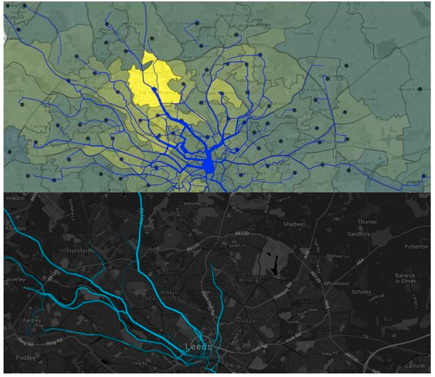
This is all useful information, especially when we look at how the cycling potential could shift in the future. However, it provides little information about where current and future cyclists actually go. This is where the desire line level can be useful. This can be selected by clicking on the Straight Lines option from the Cycling Flows dropdown menu. The results (zoomed in for Leeds) are shown in the figures below (see Figure 3 in the paper).
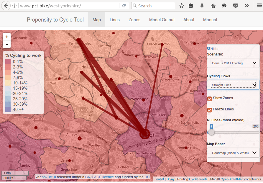
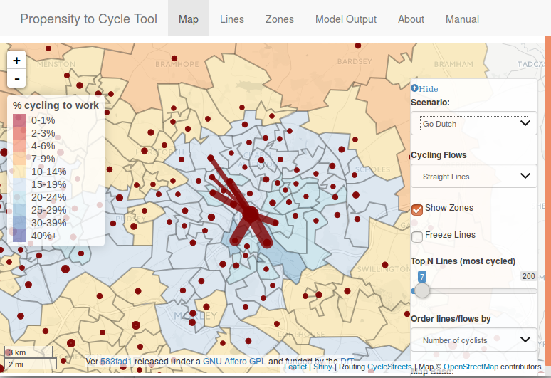
What the above figures show is that as the level of cycling increases in a city, the spatial distribution of cycling can be expected to change. Under current conditions (be they related to socio-demographics or infrastructure or other factors), cycling in Leeds is dominated by the travel corridor to the north of the city centre. Yet there are clearly many short trips taking place from the south into the centre, as illustrated by the high cycling potential south of the city under the Go Dutch scenario.
Allocating cycling potential to the route network
This is where CycleStreets.net comes into play.
We know how many people go from A to B by cycling from Census data. But we have very little idea of how they are likely to travel. This is where the routing algorithm of CycleStreets.net comes in handy. We used the CycleStreets cycle routing API to estimate the ‘fastest’ route for all short (well, up to 20 km in Euclidean distance) desire lines in England.
Not only does CycleStreets.net allow us to find all the fastest routes, a good indication of where new infrastructure should be built as people (especially women and elderly) have a strong preference for cycling along the most direct routes.
The results of all this routing work is illustrated in the future below, which shows the fastest and quietest routes associated with the top cycled routes in Leeds.
Interestingly, the big fat line up to the north-west is Otley Road, well-known to have very high level of cycling. This also shows up in Strava data as having high current levels of cycling:
This is not formal validation but it is a good sign that the PCT and other data sources line-up for the current level of cycling. The big question is whether the PCT’s estimates of cycling levels under various cycling futures, including Go Dutch.
Here is not the place to answer such a question. Only the passage of time, and commitment from people (perhaps informed by models such as the PCT) to sustainable travel will help answer that one.
There is much more to say about the use of CycleStreets.net in the PCT but it gets rather technical very quickly.
Suffice to say at this stage that it involved writing lots of code in R, a language for statistical programming, and that this has now resulted in the publication of stplanr, an R package for sustainable transport.
(For more on how to install R and (for bells and whistles) RStudio, which this blog post was written in, please see the relevant sections of the book Efficent R Programming (Gillespie and Lovelace, 2016).)
With R installed, stplanr can be installed with:
install.packages("stplanr")With this package installed, you can start using the CycleStreets.net routing algorithm with the following function:
library(stplanr)
route = route_cyclestreet(from = "Leeds", to = "Cambridge")
which results in spatial data, which can be visualised as follows:
library(leaflet)
leaflet() %>% addTiles() %>% addPolylines(data = route)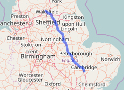
There is much more I could say about the technical side of things but at the request of the editors I will leave it there for now. For more info please see the stplanr vignette.
I plan to follow this overview article up with a more technical blog post in the New Year. Watch this space!
Reference
Lovelace, R., Goodman, A., Aldred, R., Berkoff, N., Abbas, A., & Woodcock, J. (2016). The Propensity to Cycle Tool: An open source online system for sustainable transport planning. Journal Of Transport And Land Use, 0. doi:10.5198/jtlu.2016.862