We’ve been working on a new website, Bikedata (working title), providing cycle campaigners around the UK with a ‘one-stop shop’ for data that helps them in their work.
Today we announce the open beta of the site – ready for you to try out, but we know there are bugs.
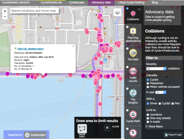
Collision data
Helping campaigners campaign
Getting more people cycling means improving the infrastructure on our streets so that everyone, whatever ability or level of confidence, is able to cycle easily and safely.
To achieve this, cycling campaign groups around the country work daily to make the case for cycling. They look at traffic consultations, propose changes to the highway, scrutinise planning applications, and work with local people and their local council to achieve these improvements.
Getting changes on the ground involves both a solid factual case for improvements as well as making an emotional case. For instance, reducing speed limits to tame traffic relies on having good access to collision data to demonstrate that there is a problem.
Thanks to our Outlandish Fellowship and some kind follow-on funding, we’ve been working on Bikedata, which is now ready as a beta site. (Beta means there are some problems we know about still but it’s good enough to start making public.)
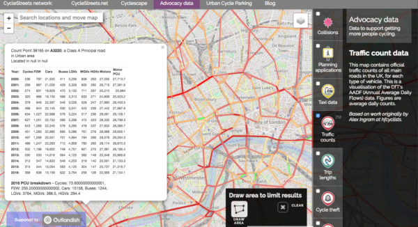
Traffic counts
Data to make campaigning easier
The site gives you direct access to UK data for:
- Collisions
- Planning applications
- Traffic counts
- Cycle theft
- Trip length (from CycleStreets journey planner)
- Problems reported by cyclists
- Photos (72,000+ images) for campaigning
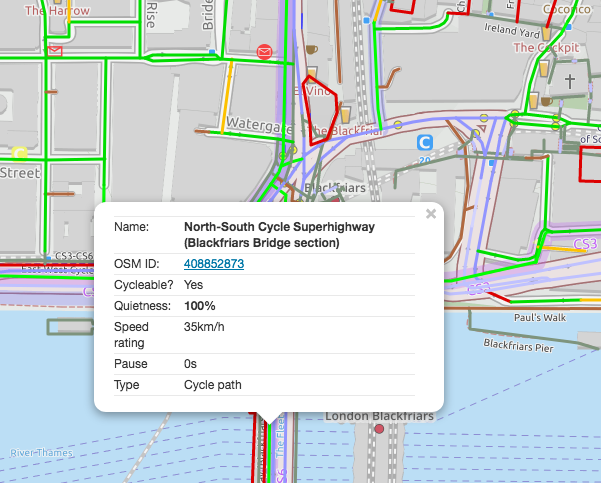
- Cycleability ratings of every street and path
- Campaign groups around the UK
In most cases, you can use filtering controls to show what you want to find. For instance, you can filter collision data to showing serious/fatal collisions at junctions. Or, perhaps you’d like to see all the reported places where cycle parking is needed:
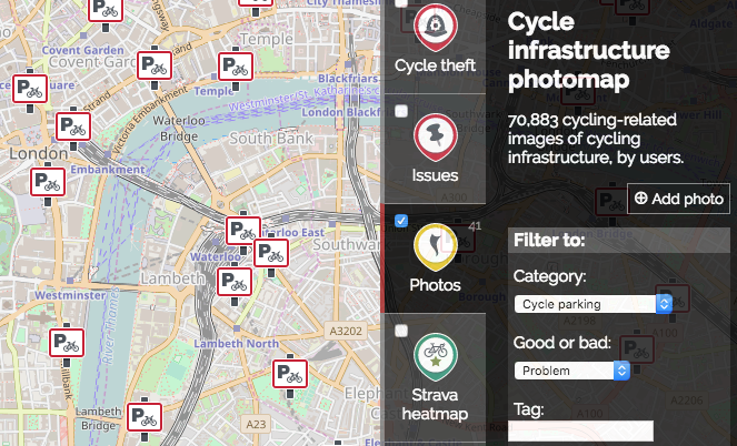
Cycle parking problem locations – filtering in action
You can enable multiple layers at once. Our aim with this in the future will be to enable various correlations, e.g. showing how high pollution and traffic levels in an area might result in low levels of cycling.
You can also (again in most but not all cases), draw over an area to filter for that. Some layers also have an export facility enabled, so that you can easily obtain a spreadsheet of the same data as the map is showing.
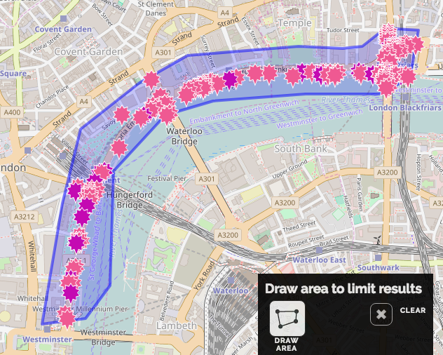
Area drawing, to obtain an area for export
What layers do we want to add next?
- Pollution
- Taxi data (Cambridge only at this stage)
- Census trip data
- School travel data
- … and more!
Next steps
We’re on the lookout for funding to enable us to develop this further. We’ve achieved everything you see with under £7k of funding, so think how much further the site could go.
Things we want to do include:
- Change the UI so that it automatically ‘tells a story’
- Add more data layers, e.g. pollution and accessibility analysis
- Add charts to show change over time, ‘telling a story’
- Add heat map views of several layers
- Enable comparisons between Local Authority areas
- Add a proper design and interface – the current UI is essentially a prototype
- Enable more filtering controls
- Ensuring all data is up-to-date, e.g. collision data needs an update
- Add permalink URLs to enable all views to be persistent; currently this is only partially working
- Fix oodles of bugs and inconsistencies
If you’d be interested in supporting any of the above developments, please do get in touch.
Also, code contributions are very welcome – the code is open source and on Github, and should be very easy to start working on, so let us know if you need advice, or just submit pull requests!
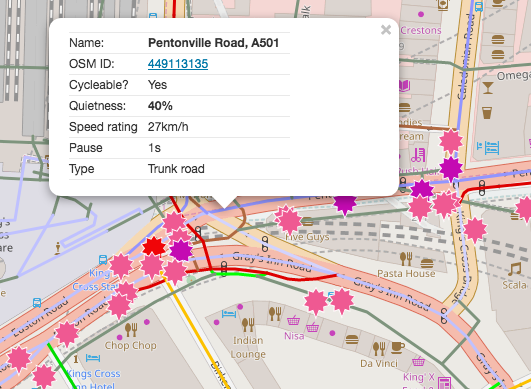
Lots of collisions, and the cycleability of the road is marked as low: 40%
Thanks
Thanks again to Outlandish Co-op, without whose funding and support would not have enabled us to get this project off the ground.

Lastly…
What should we call the site? Let us know your ideas!